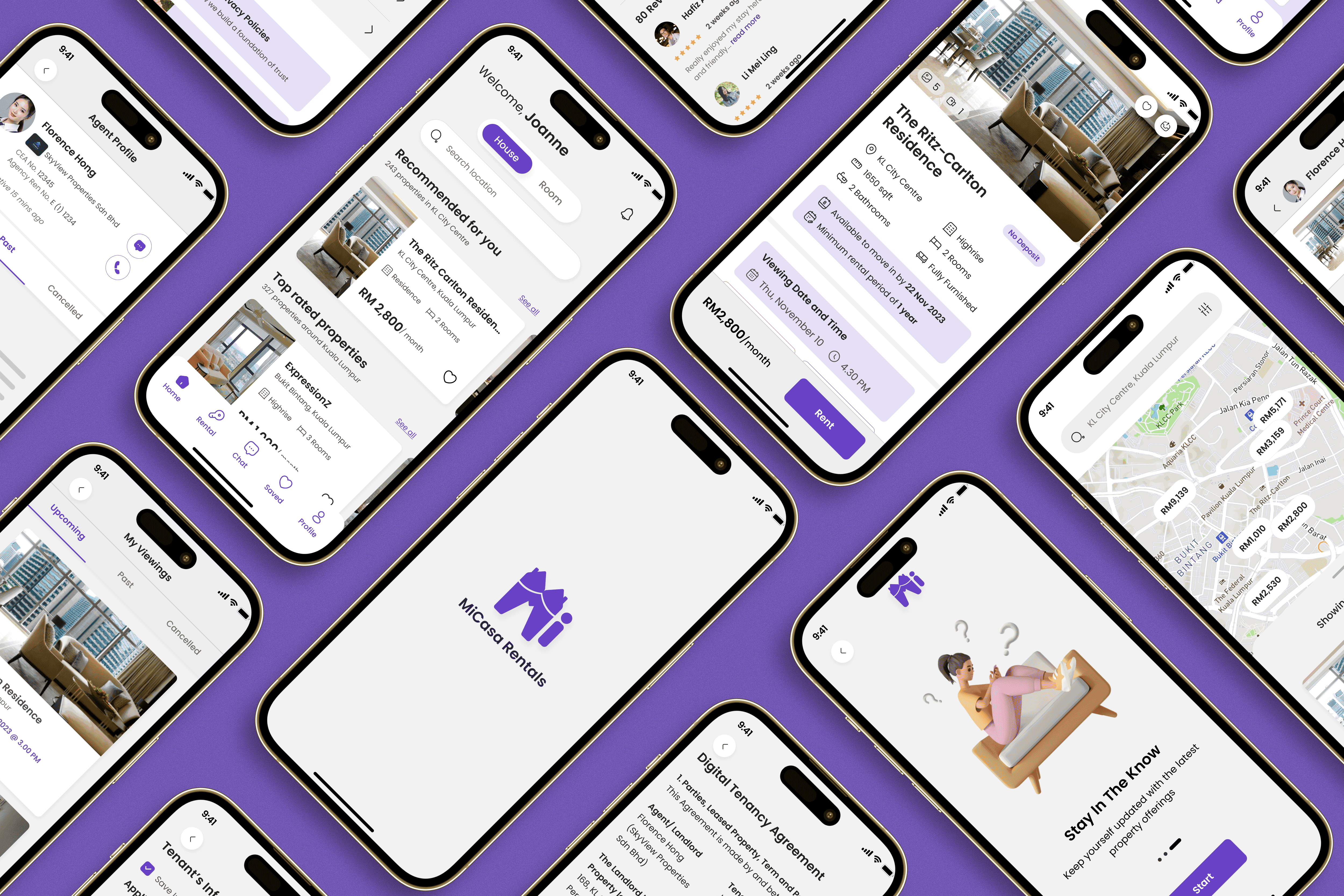
MiCasa Rental App
Reinventing the property renting process by making it easy to find, book, and pay for a home.
Role
UI/UX Designer
Industry
Property Renting
Duration
3 Months
Overview: MiCasa Rentals is a property mobile app for a long-term renting. The app connects users to various properties to rent, which includes renting a unit or a room and provides end-to-end rental process from viewing property to the initial rental payment.

Problem Statement
For people who wanted to rent a property for a long term stay, they normally face unorganized and ambigious property information, inefficient booking for physical viewing, unresponsive agents, lengthy agreement and signing processes which make the renting experience frustrating and time consuming.
With UI/UX research being implemented, MiCasa Rentals app was designed to digitalised the whole renting process, addressing issues identified in existing applications. Thus, the main problems that will be focused on is :
Lack of Maps
Time Consuming Rental Procedure
Time Consuming Property Viewing
Communication Delays with the Agent
Unclear Rental Agreements
My Approach
Discovery Phase
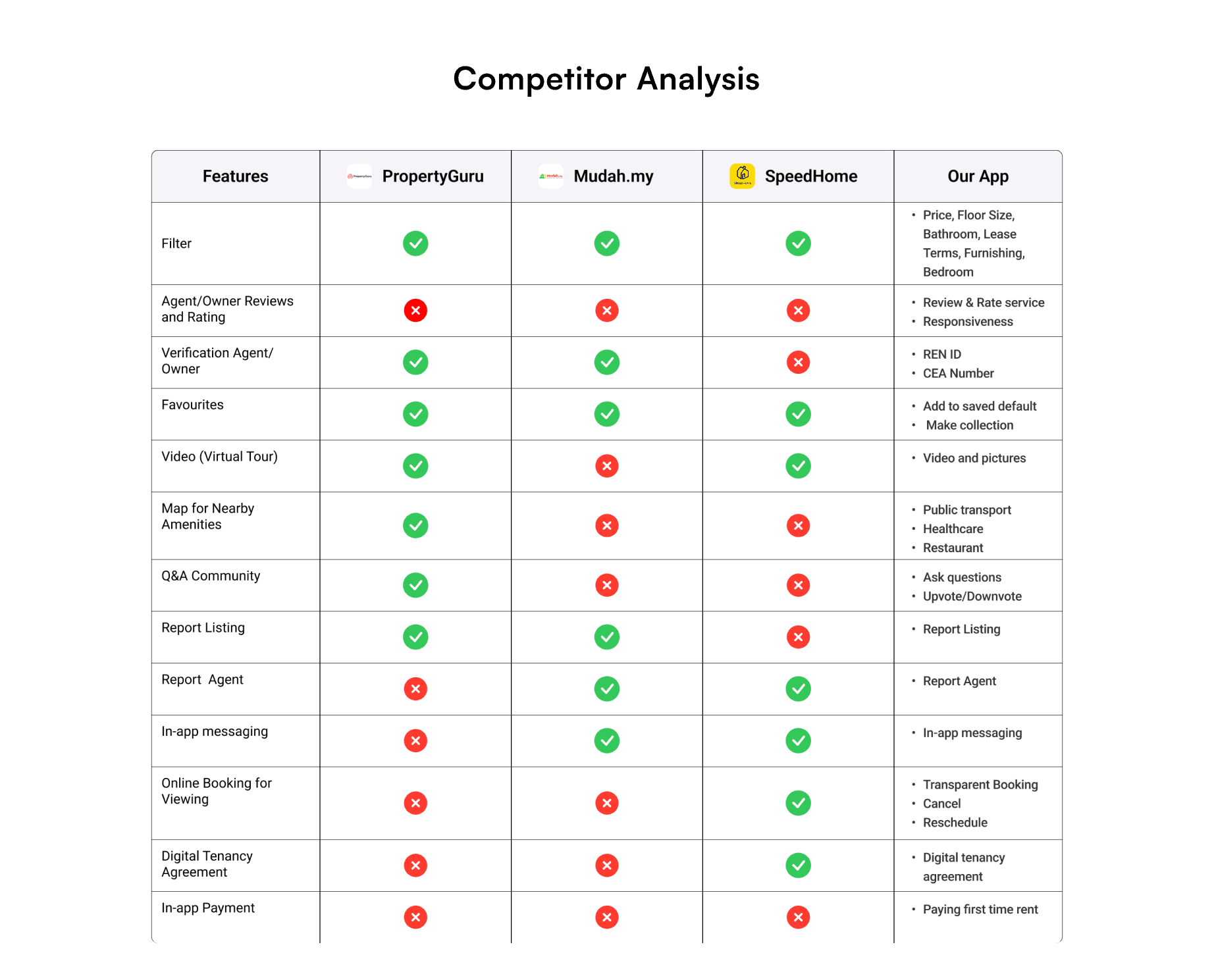
Market Research: Conducted thorough market analysis to understand user needs, competitor offerings, and emerging trends in rental apps.
User Interview: Conducted an interview to 7 people currently renting a house in Kuala Lumpur and have experience in finding long term rental house via any platform.
User Persona Development: Created detailed user personas to guide design and feature prioritization.
User Journey Mapping: Outlined the renter’s journey from discovery to move-in, identifying pain points, motivations, and opportunities for improvement based on user interviews and market research.
Closed Card Sorting: Conducted a closed card sorting session to evaluate and refine the app’s navigation and categorization, ensuring a user-friendly and intuitive structure.
Information Architecture: Designed a clear, structured layout for the app, optimizing content organization and navigation based on user insights and card sorting results.
User Flow: Designed intuitive user flows to streamline key actions, ensuring a seamless experience from property search to rental agreement, based on user needs and pain points.
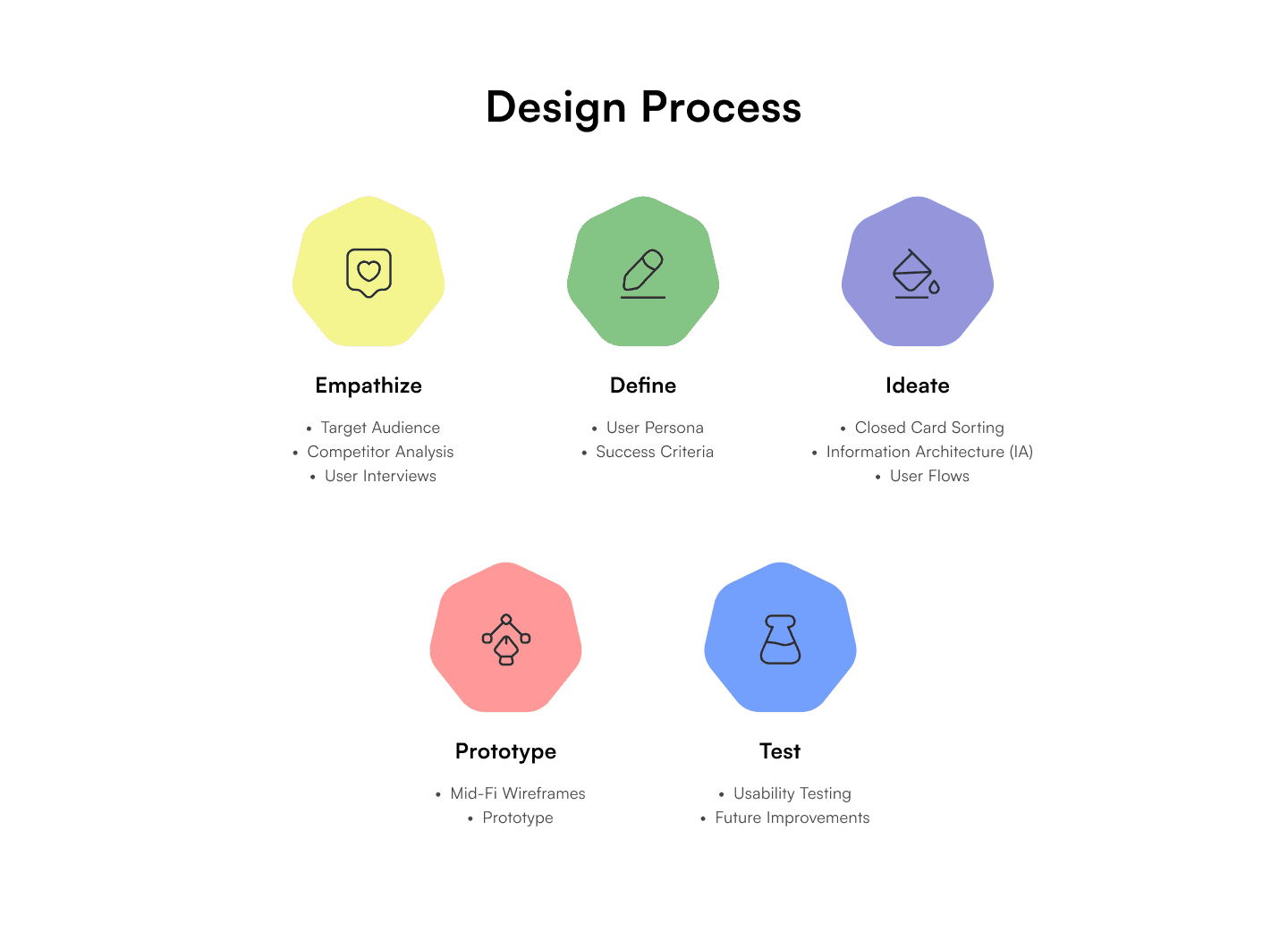


Design
Mid-Fidelity Wireframe: Developed mid-fidelity wireframes to visualize layout, functionality, and user interactions, focusing on usability and iterative improvements based on feedback.
Style Guide: Established a cohesive design system, defining colors, typography, spacing, and UI components to ensure consistency and brand alignment across the app.
Hi-Fidelity Design: Designed a clean and intuitive interface with easy navigation and visually appealing graphics to motivate users.


Testing and Iteration
System Usability Testing: Conducted a System Usability Scale (SUS) survey to measure the app’s usability, identifying areas for improvement based on user feedback.
Net Promoter Score (NPS): Measured user satisfaction and likelihood of recommendation using the Net Promoter Score (NPS), gathering insights to enhance overall user experience.
Results
The research for this property renting mobile app uncovered a lot of new information and how it works for tenants side.
Future Plans
In improving the app based on feedback, the gathered insights can be implemented to improve the product. In addition, it is worth to explore on the agent and home owner side when renting or selling a property due to its relatedness in affecting user flow for tenants side.
Also, recently in searching to rent a new place for myself, I discovered the existence of hiring agents as a service to rent and promote a place. I believe this niche area will affect the business goals of this case study in the long term. Discovering more on how agents worked has opened up to new possibilities for MiCasa Rental.
Reflections
Inspired by my personal experience of moving from Sabah to KL, going through multiple apps and platforms, having a ride of emotions to find the perfect rental home is something I'll keep close in heart. To be able to finish this case study, has shown me so much of the beauty of UI/UX especially in the discovery and research phase. Getting to talk with users regarding their experiences and trying to understand their problems and what solutions to solve it is my favourite part of this case study.